
Dark mode is not a feature anymore. It’s a trust signal.
Dark Mode vs Light Mode UX: Best Practices, Tokens, Toggles, and Accessibility
Most teams treat dark mode like a cosmetic toggle. Users don’t.
They read it as:
- “This product respects my environment.”
- “This product respects my eyes.”
- “This product is modern.”
- “This product is built with care.”
When dark mode is done poorly, it shows instantly:
- Text halos or vibration (especially for astigmatism)
- Contrast issues that break readability
- Brand colors that feel harsh or neon
- Icons that disappear
- Charts that lose meaning
At Orizon, we design theme-aware interfaces that balance brand, readability, and accessibility - because dark mode isn’t decoration; it’s part of the product experience.
🌗 Dark mode or light mode - your users deserve both done right. Let's design yours the right way →
Quick truth: dark mode is not always better
Dark mode can save battery on OLEDs but introduces usability issues if not done carefully. Accessibility isn’t automatic either.
The goal isn’t to “force dark mode.” It’s to offer a great experience in both modes, with a respectful default.
When light mode wins
Light mode is usually best when:
- Users read long text (docs, news, knowledge bases)
- Users work in bright environments
- The UI is dense or scanning-heavy
Why: readability is more stable with dark-on-light text, especially for small type.
When dark mode wins
Dark mode shines when:
- Users work in low-light environments
- The product is used at night (media, messaging, trading)
- The UI is control-heavy, not reading-heavy
- You want a focused, immersive feel
Battery savings matter only if bright pixels are managed carefully.
Best default: System + user choice
The easiest way to get dark and light modes right is to respect both the device and the user.
Here’s how it works:
- Start with the system preference – most devices let users pick dark or light mode. Using the CSS prefers-color-scheme, your product can automatically match that setting, so it “just works” out of the box.
- Give users control – let people override the default if they want light, dark, or system mode. A simple toggle in settings (or quick access in the header) keeps the experience flexible.
- Remember their choice – once a user picks a mode, persist it so every session respects their preference.
Why this matters:
- Accessibility first: Users with visual sensitivities may need a specific mode.
- User trust: People feel respected when your product adapts without forcing a theme.
- Consistency: Persisting the choice ensures the experience feels predictable and polished.
At Orizon, we follow this principle in every design system we build: interfaces that adapt to people, not the other way around.
Dark mode mistakes that quietly break UX
1. Pure black backgrounds
Harsh contrast and tricky elevation. Use near-black instead.
2. White text at 100% opacity
Can “vibrate” visually. Use opacity steps for hierarchy.
3. Brand colors become neon
Adjust chroma for dark mode; create semantic dark variants.
4. Images and charts aren’t theme-aware
Provide theme-specific logos, illustrations, and data visualizations.
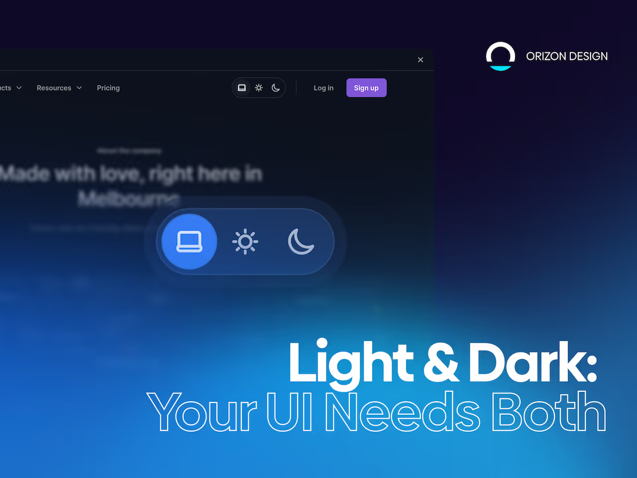
5. Confusing toggles
A 3-state selector (System, Light, Dark) is clear. Quick access in settings or header works best.
Design-system approach: tokens
Scalable light/dark themes need a token system:
- Primitive tokens – raw values
- Semantic tokens – meaning-based (bg, surface, text, border, accent)
- Component tokens – optional mapping
Orizon uses token-driven systems to ensure consistency across modes and future-proof scalability.
Practical checklist: ship-ready themes
Before launch:
- Contrast passes WCAG for text and icons
- Focus states are visible
- Charts preserve meaning
- Elevation works in light & dark
- Images/logos have theme variants
- Toggle supports System, Light, Dark
- Theme doesn’t flash on load
- Empty/disabled states remain clear
- Colors tuned for accessibility (error, warning, success)
- Tested in bright light, low light, and on OLED
The real takeaway
Dark mode is not just a color inversion - it’s a second interface.
Teams that treat it as a real interface gain trust fast. Teams that ship an afterthought lose credibility quietly.
Ready to make your themes feel premium in every mode?
If you’re building a design system, scaling a SaaS, or redesigning a platform, we can help you create token-driven color systems that stay consistent across light, dark, and future themes.
Let’s build UI that scales beautifully. Reach out to us today! 🚀

Keep Reading
More from Orizon

Let's talk
Design done right and fast by people you can trust.

%20(1).png)


.svg)
.svg)

.svg)