Top Design Tips for E-commerce Success
How To Boost Cart Conversion
Picture this: You’re browsing an online store, you find a product you love, you add it to your cart, but when it comes to checkout, something feels off. Maybe the process is too complicated, or the page looks cluttered and untrustworthy. Chances are, you’ll abandon your cart and move on. As web designers, it’s our job to ensure that doesn’t happen to your customers. Let’s dive into some best design practices to increase cart conversion rates on e-commerce platforms.
Simplify the Checkout Process

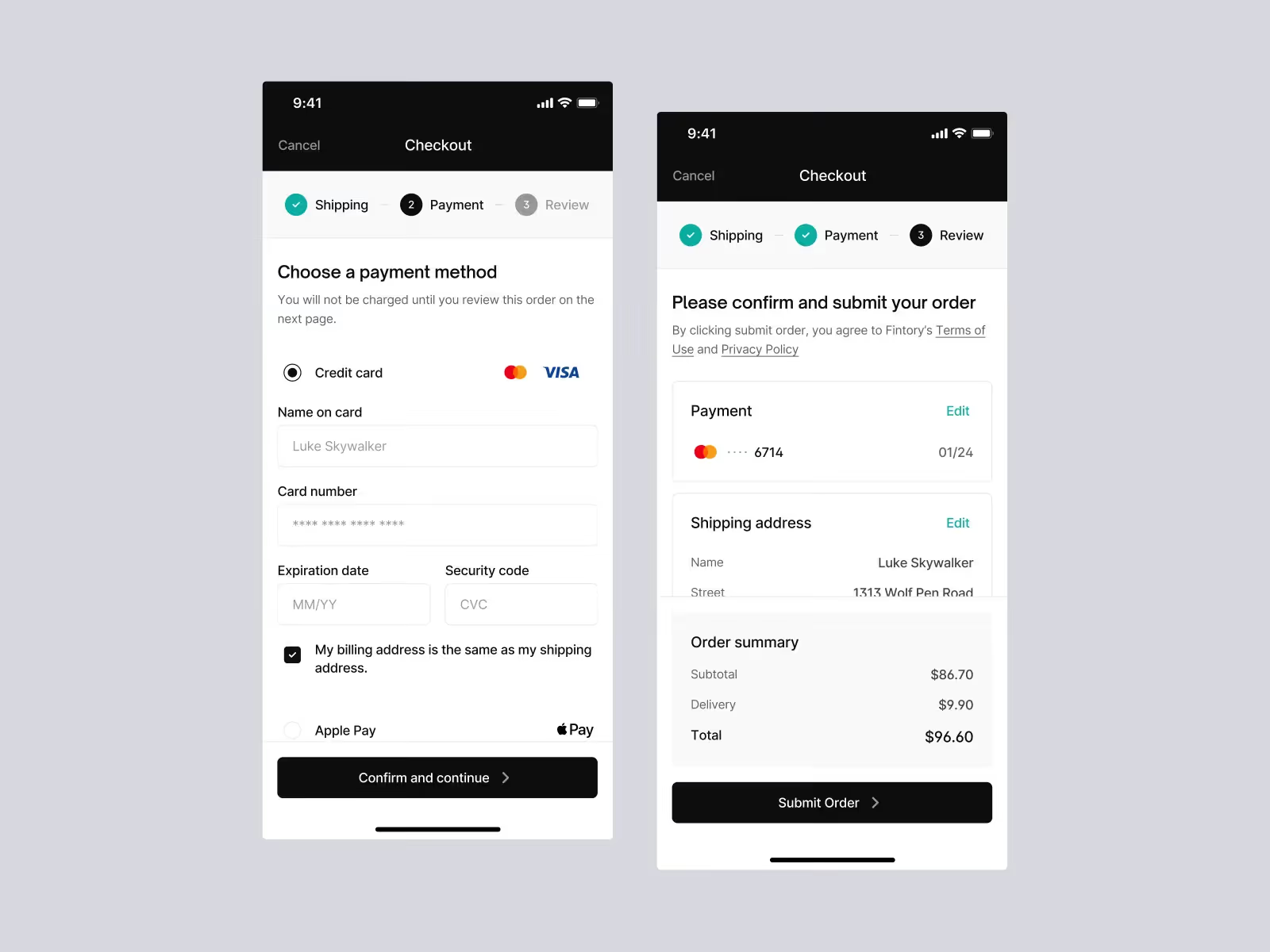
1. Streamline the Checkout Flow: A smooth and straightforward checkout process is crucial. Minimize the number of steps required to complete a purchase. One-page checkouts are increasingly popular because they reduce friction and keep users engaged.
Imagine walking into a physical store, picking up an item, and then having to go through ten different counters to pay for it. Frustrating, right? The same applies online. The fewer clicks, the better.
2. Enable Guest Checkout: Forcing users to create an account before purchasing can be a major turn-off. Offer a guest checkout option to make the process faster and more convenient. You can always prompt them to create an account after they’ve completed their purchase.
Build Trust and Transparency

3. Use Trust Signals: Include trust badges, secure payment icons, and customer testimonials on your checkout page. These elements reassure customers that their payment information is secure and that they’re dealing with a reputable business.
Remember, online shopping lacks the physical assurance of a brick-and-mortar store. Trust signals act as the digital equivalent of a friendly salesperson.
4. Show Clear Pricing: Make sure all costs, including shipping, taxes, and any additional fees, are transparently displayed before the final checkout. Unexpected costs can cause cart abandonment faster than you can say “hidden fees.”
Enhance User Experience

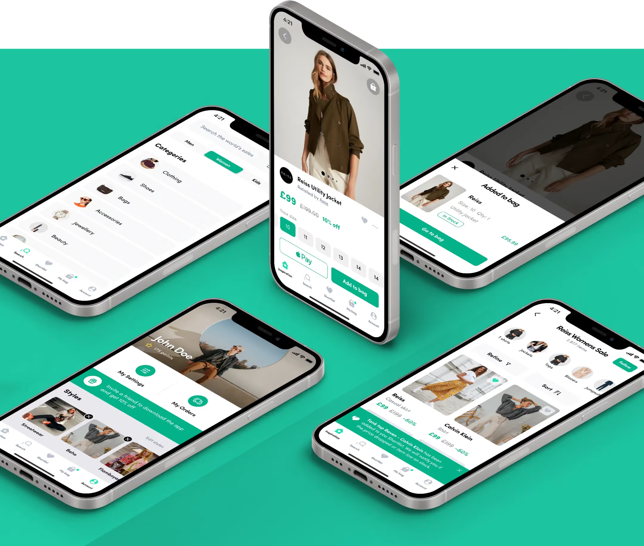
5. Optimize for Mobile: With more people shopping on their smartphones, having a mobile-optimized checkout process is non-negotiable. Ensure buttons are easy to tap, forms are simple to fill out, and pages load quickly on mobile devices.
Think about the last time you tried to buy something on a site that wasn’t mobile-friendly. Frustrating, wasn’t it? Don’t let your customers feel the same.
6. Implement Autofill and Autocomplete: Autofill and autocomplete features can significantly speed up the checkout process by reducing the amount of information customers need to type. This is especially helpful on mobile devices, where typing can be more cumbersome.
Provide Clear Calls to Action

7. Use Strong, Action-Oriented Language: Your call-to-action (CTA) buttons should be clear and compelling. Instead of a generic “Continue,” use “Complete Purchase” or “Place Order.” The language should guide users and make them feel confident about the next step.
8. Design Visually Appealing Buttons: Ensure your CTA buttons stand out with contrasting colors and are large enough to be easily clickable. The last thing you want is for users to miss the checkout button because it blends in with the rest of the page.
Personalize and Engage
9. Offer Personalized Recommendations: Suggest related products or complementary items in the cart. Personalized recommendations can increase the average order value and make customers feel that the shopping experience is tailored to them.
Imagine you’re buying a camera, and the store suggests a perfect lens to go with it. It’s convenient and shows that the store understands your needs.
10. Send Cart Abandonment Emails: If a customer does leave without completing their purchase, a well-timed cart abandonment email can bring them back. Make sure these emails are friendly, remind them of what they left behind, and offer assistance if needed.
Conclusion
Increasing cart conversion rates is all about making the shopping experience as seamless, secure, and engaging as possible. By simplifying the checkout process, building trust, optimizing for mobile, providing clear CTAs, and adding a personal touch, you can significantly reduce cart abandonment and boost your sales.

Keep Reading
More from Orizon
Let's talk
Design done right and fast by people you can trust.


%20(1).png)


.svg)
.svg)

.svg)