
The Art of the Hero Section
Common Hero Section Design Layouts and When to Use Them
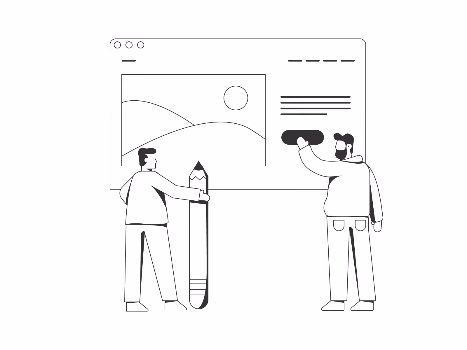
Cover illustration by Manuel Sanches
The hero section is often the first thing visitors see when they land on your website. It’s your opportunity to make a powerful first impression, convey your brand’s message, and engage users right from the start. But with so many design options, how do you know which layout to choose? Let’s explore some common hero section designs, their strengths, and the scenarios in which they shine or fall short.
1. The Full-Screen Background Image
This layout features a striking full-screen background image or video with a headline and call-to-action (CTA) layered on top. It’s visually immersive and can create an immediate emotional impact.

When to Use:
- Visual Branding: When you have high-quality imagery or video that encapsulates your brand’s essence.
- Emotional Appeal: To evoke strong emotions and connect with users on a personal level.
- Simple Messaging: When your message is straightforward and can be conveyed with a few words.
When Not to Use:
- Content-Heavy Sites: If you need to convey a lot of information upfront, this layout might not be the best choice.
- Poor Imagery: When you lack high-quality visuals, as low-resolution images can detract from the user experience.
2. The Split-Screen Layout
This design divides the hero section into two parts, usually with an image or graphic on one side and text on the other. It offers a balanced and organized presentation.

When to Use:
- Dual Messages: When you have two equally important messages or elements to highlight.
- Contrast: To create a visual contrast that draws attention to both the image and the text.
- Versatility: Suitable for a variety of industries and purposes, from product showcases to service descriptions.
When Not to Use:
- Single Focus: If you need to convey a single, strong message, a split-screen can dilute the impact.
- Complex Layouts: When additional elements make the layout feel cluttered and hard to navigate.
3. The Minimalist Approach
A clean, simple hero section with plenty of white space, a succinct headline, and a clear CTA. It focuses on clarity and elegance.

When to Use:
- High-End Products/Services: To convey sophistication and exclusivity.
- Clear CTA: When you want the CTA to stand out and drive specific actions.
- Fast Loading: For a quick, seamless user experience.
When Not to Use:
- Vibrant Brands: If your brand relies on bold, dynamic visuals, minimalism might feel too subdued.
- Informative Needs: When you need to provide more detailed information right away.
4. The Text-Heavy Layout
This hero section prioritizes text over visuals, with ample space for a detailed headline, subheadings, and a CTA.
When to Use:
- Complex Offerings: When you need to explain complex products or services.
- SEO Benefits: Text-rich hero sections can be beneficial for search engine optimization.
When Not to Use:
- Visual Brands: If your brand’s strength lies in its visuals, a text-heavy approach may not do it justice.
- Readability Issues: When too much text could overwhelm or deter users.
5. The Interactive Hero
An engaging hero section that incorporates interactive elements like animations, hover effects, or scroll-triggered animations.

When to Use:
- User Engagement: To captivate and retain users’ attention.
- Brand Experience: When interaction aligns with your brand’s identity and enhances the user experience.
When Not to Use:
- Load Times: If it significantly impacts page loading speed.
- Simplicity: When a straightforward, immediate message is more effective.
6. The Asymmetrical Layout
This design breaks away from traditional grid structures, using overlapping elements, varied shapes, and unconventional placements to create a dynamic, eye-catching hero section.

When to Use:
- Creative Industries: Perfect for art, design, and fashion brands that want to showcase creativity and innovation.
- Attention-Grabbing: When you need to capture user interest immediately with a bold, unconventional look.
When Not to Use:
- Conservative Brands: If your brand values are centered around tradition and formality, this might feel too radical.
- Clarity: When clarity and straightforward navigation are crucial.
Conclusion
Choosing the right hero section layout depends on your brand’s goals, the message you want to convey, and the user experience you aim to create. Whether you opt for a visually stunning full-screen image, a balanced split-screen, a clean minimalist design, a dynamic carousel, a text-rich layout, or an interactive hero, each has its place. Consider your audience, your brand’s strengths, and the context in which your website will be used to make the best choice.

Keep Reading
More from Orizon

Let's talk
Design done right and fast by people you can trust.

%20(1).png)


.svg)
.svg)

.svg)