Best Practices to Boost User Satisfaction
UX/UI for SaaS Startups
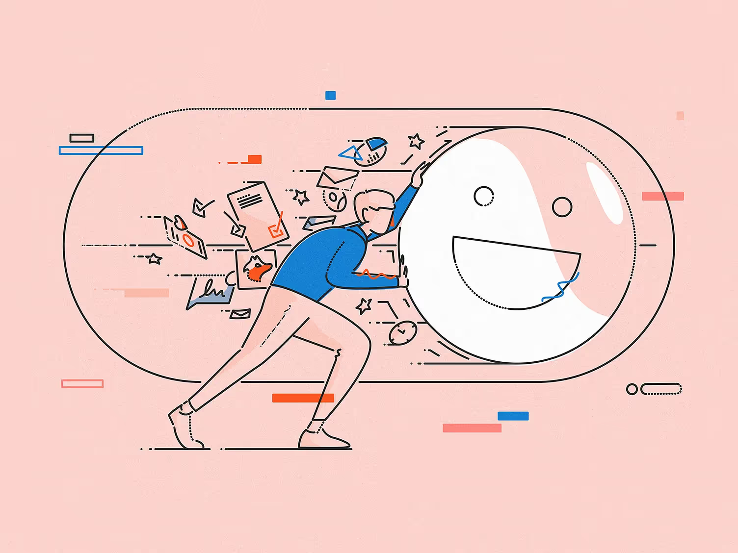
Cover illustration by James Oconnell
When it comes to SaaS (Software as a Service) businesses, it’s easy to get caught up in the endless possibilities of features and functionality. Startups often want to deliver the most powerful solution possible. But here’s the thing: users don’t care about features nearly as much as they care about how they interact with them. The key to long-term SaaS success isn’t just in your code, it’s in your UX/UI design.
A well-designed SaaS platform can create experiences that are intuitive, enjoyable, and, most importantly, easy to use. The reality is, that most users don’t want to have to think too hard when they’re using software. They want to log in, accomplish their tasks efficiently, and move on. Let’s talk about how you can make that happen.
1. Understand the Flow, Then Simplify It
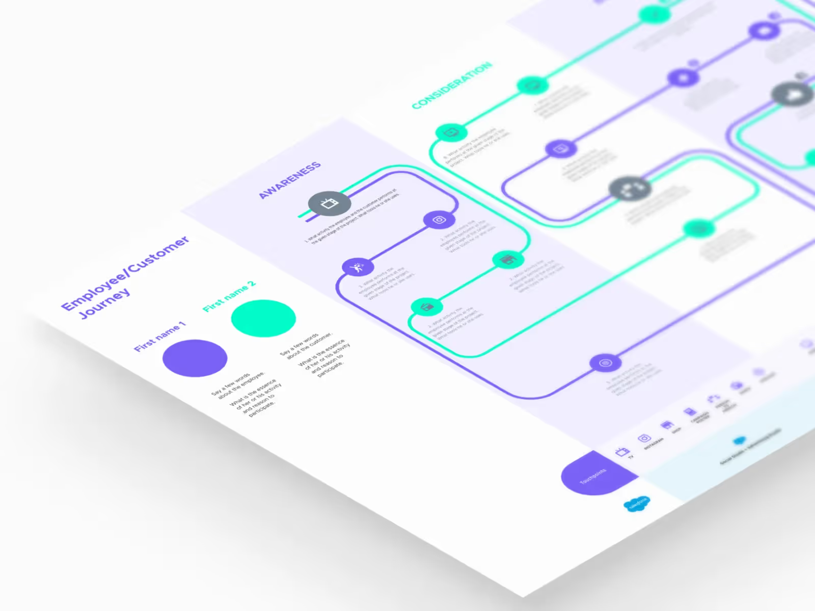
When designing SaaS products, one of the most important aspects is the user flow (how users navigate from point A to point B, and ultimately accomplish their goals within your platform). Too often, SaaS products make this journey feel like a scavenger hunt, which leads to frustration and churn.

Before jumping into design, map out the entire user flow from the perspective of your target audience. What is their main objective? What steps do they need to take to get there? Once you’ve identified that, it’s time to simplify. The fewer clicks and distractions, the better. Resist the temptation to throw every feature upfront. Prioritize, and let users uncover deeper functionality organically as they get more comfortable with the product.
2. Keep Dashboards Clean, Yet Informative
Dashboards are the heart of any SaaS platform. Users rely on them to get an at-a-glance view of important data and take action. The challenge is providing enough information without overwhelming the user.

First, ask yourself what information is truly essential for users when they first log in. Make that the star of the dashboard. You can use progressive disclosure to reveal more complex data only when necessary. For example, give users the ability to customize their dashboards by dragging, hiding, or rearranging widgets based on their preferences. This flexibility not only enhances user satisfaction but also fosters a sense of ownership over their workspace.
3. Optimize for Speed and Performance
Users of SaaS products are busy people. Whether they’re managing teams, sales pipelines, or analytics, their focus is on efficiency. If your app is slow or requires excessive loading time, they’ll look for alternatives.
Speed is part of the user experience, and it’s one area where UI design can really shine. Use skeleton screens, where an empty version of the screen shows up immediately and gets filled in as data loads, rather than a generic loading spinner. It gives users the impression that the app is faster than it might actually be, which reduces frustration.
4. Design with Onboarding in Mind
Most SaaS platforms have a learning curve. But the initial experience users have with your product is critical. If they don’t understand how to use it within the first few minutes, they might never come back. Effective onboarding can prevent this.

An interactive product tour or guide is usually more effective than a long video or help manual. And make sure it’s contextual — guide users through the platform step by step, only introducing features when they’re relevant. Remember: keep it short and actionable. Don’t flood users with unnecessary information right at the beginning. Instead, let them experience the basics and gradually introduce more advanced features as they explore.
5. Consistency is Key
The fastest way to confuse a user? Inconsistent design. If your buttons change shape, colors flip without reason, or icons shift around depending on the page, users will quickly become frustrated. In SaaS, consistency breeds familiarity, and familiarity leads to efficiency.

Establish a design system early on. This includes consistent typography, color schemes, button styles, and spacing. Consistent UI design reduces cognitive load, which means users can navigate your platform more naturally. And don’t forget about microinteractions — small animations or feedback that let users know when they’ve completed an action. These might seem like minor details, but they provide clarity and create a more intuitive experience.
6. Responsive Design is Not Optional
With more people accessing SaaS platforms on mobile or tablet devices, responsive design isn’t just a “nice-to-have,” it’s an absolute must. Users expect seamless transitions across devices. What works perfectly on a desktop should be equally smooth on a tablet or phone.

But responsive design for SaaS can be tricky because there’s often a lot of data and functionality to fit into smaller screens. Focus on core functionality when designing for mobile. For instance, a complex data table on desktop might need to be reimagined as a simpler list or series of cards on mobile. Give users the tools they need while cutting out unnecessary elements when space is limited.
7. Usability Testing is Your Best Friend
If you’re building a SaaS platform without regularly testing it with real users, you’re designing in the dark. What seems obvious to your team may be utterly baffling to someone without insider knowledge. That’s why usability testing is crucial, especially in the early stages.
You don’t need a huge budget to test usability. Tools like Lookback or Hotjar allow you to see how users are interacting with your platform and where they’re running into friction. And don’t be afraid to ask for feedback directly from your early users. The more you iterate based on real user data, the more user-friendly your platform will become.
Conclusion: Design with Your Users at the Center
The bottom line for any SaaS startup? Your software is only as good as your users’ ability to use it. The most powerful features mean nothing if users can’t find them, understand them, or apply them to their work. Focus on clear user flows, clean dashboards, fast performance, and consistent, responsive design. And above all — test, iterate, and refine based on real user feedback.
The result? A SaaS platform that feels intuitive, makes users’ lives easier, and keeps them coming back — boosting satisfaction and helping your business grow.

Keep Reading
More from Orizon
Let's talk
Design done right and fast by people you can trust.


%20(1).png)


.svg)
.svg)

.svg)