
A Guide for Brands That Want to Win
How to Onboard More Users With Great Design
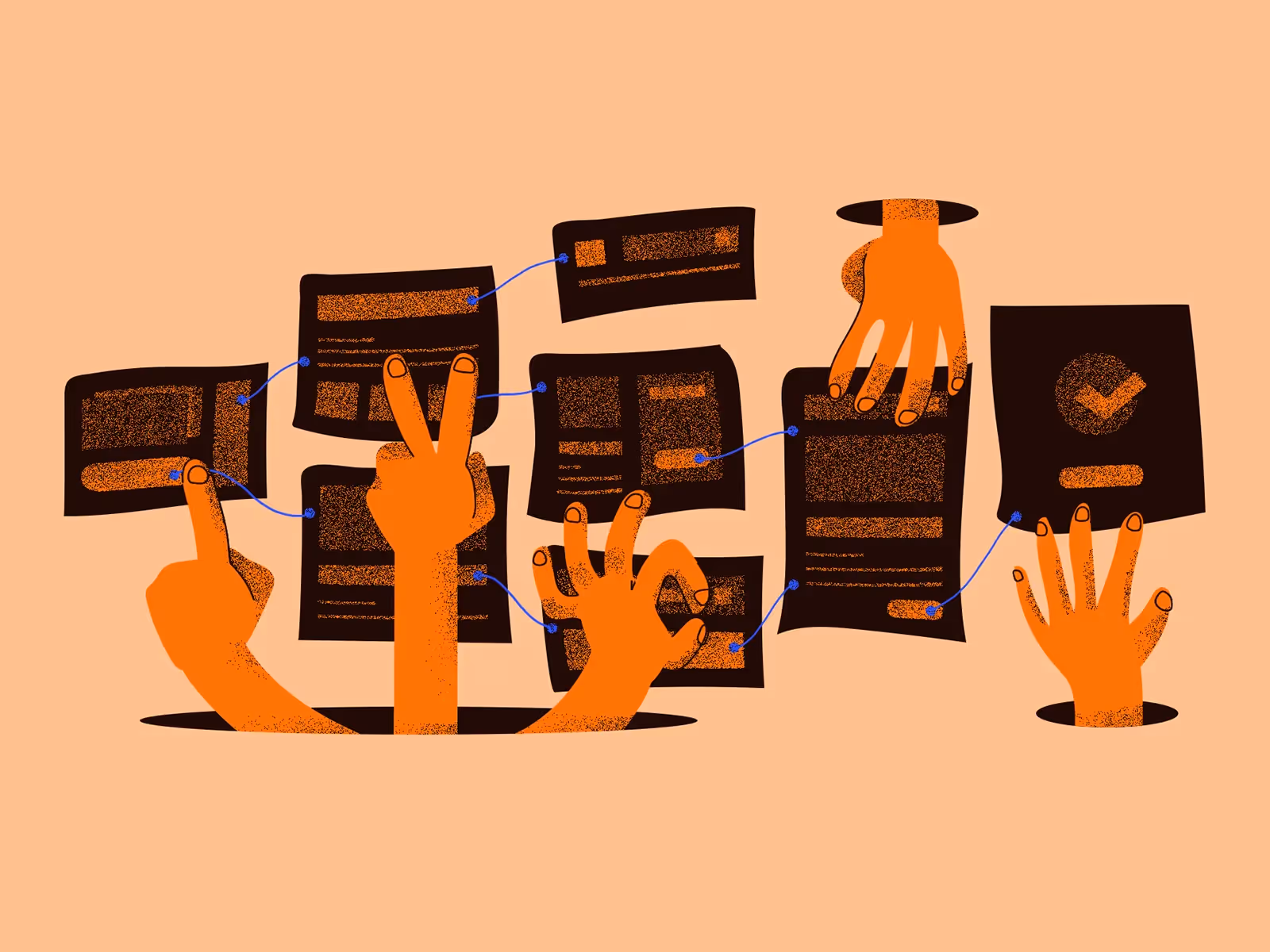
Cover illustration by Huī Lín
Let’s get something straight: onboarding isn’t just a “welcome email” or a splash screen with your logo slapped on it. Onboarding is the handshake, the first impression, the moment your users decide whether they’re sticking around — or ghosting your app forever. So, how do you get them to swipe right on your product?
It’s all about great design.
You don’t need to read a lengthy manifesto to know that design is more than just aesthetics — it’s how users interact, feel, and ultimately decide whether they’ll keep coming back. Below, we break down the key principles that will take your user onboarding process from forgettable to frictionless.
1. Start with Empathy, Not Features
Here’s the harsh truth: nobody cares about your app’s 37 features when they first sign up. People care about what your app can do for them. That’s where empathy comes in.
Great design begins with understanding your users’ problems, desires, and expectations. It’s about answering, “What’s in it for them?” This isn’t a place for dumping product specs or highlighting how long it took you to develop Feature X. Lead with what matters to them.

💡 Tip: Craft a user journey map before designing anything. Know where users will feel overwhelmed, what motivates them, and where you can insert moments of delight. Make it about them, not you.
2. Simplify the Flow
There’s a tendency to think the more steps in onboarding, the better the introduction. More isn’t more — at least not here. Each extra click, form field, or unnecessary tooltip increases the chances of user drop-off.
The goal? Get users to their “aha” moment as quickly as possible. If it takes three steps instead of five, great. If it takes two, even better. People are impatient. Design like you know that.
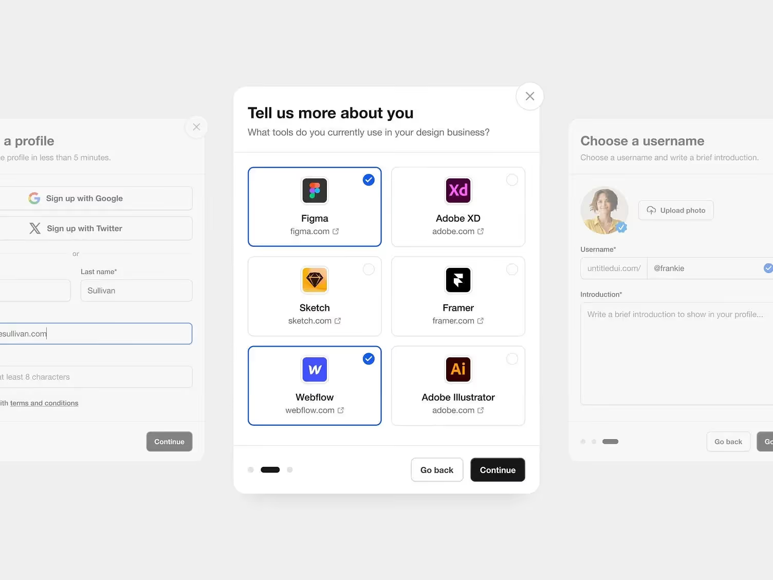
💡 Tip: Use progressive disclosure to keep things simple. Show users only what they need to know when they need to know it. Don’t bombard them with every detail at once.
3. Guide, Don’t Hover
No one wants to feel micromanaged — even by an app. There’s a fine line between being helpful and being annoying. Tooltips, walkthroughs, and tutorials can be great, but they need to be contextually relevant. Avoid the temptation to bombard users with “click here, do this” every two seconds.
Instead, think of onboarding as a conversation. Guide users through your product naturally — don’t force them to read an essay before they even get to use it.
💡 Tip: If you’re going to use tutorials, make them dismissable. Let users explore at their own pace, with easy access to help when they need it.
4. Design for Trust
Think about it: the first thing a lot of onboarding processes ask for is personal info — email, name, sometimes even payment details. Trust is currency here. If users don’t feel comfortable, they’re out.
Your design should feel intuitive, but more importantly, it should feel safe. Use clear language, display privacy policies in easy-to-find places, and show social proof (like testimonials or security badges) during critical moments like sign-up.

💡 Tip: Incorporate micro-interactions (like animations or visual feedback) to give users a sense of progress and reassurance. Let them know the system is working for them.
5. Make It Beautifully Consistent
A clunky, jarring interface can make even the best features feel like a chore. Consistency in design — from fonts and colors to button placements and icons — makes your product feel polished and professional. But it’s more than that. A consistent UI makes it easier for users to predict what comes next, which reduces friction.
And don’t underestimate the power of branding in your design. Onboarding is the perfect time to reinforce your brand identity. Colors, tone of voice, visual elements — it’s all part of the story you’re telling.

💡 Tip: Develop a style guide and stick to it. Ensure every element — from typography to button hover states — fits within your design ecosystem.
6. Test. And Then Test Again
You know what they say about best-laid plans, right? Even with the most thought-out design, you can’t assume it’ll hit the mark without real-world testing. Conduct user testing early and often. Sometimes what makes sense to the design team falls flat in the hands of users.
Great onboarding doesn’t happen by accident — it’s iterative. The more you test, the more you refine, and the better your results.
💡 Tip: Run A/B tests on different onboarding flows. Measure drop-off rates, time-to-value, and overall user satisfaction to see what’s working (and what isn’t).
Final Thoughts: Design Like You’re Onboarding People, Not Users
It’s easy to get caught up in the technicalities of design and forget the human side of onboarding. But ultimately, design is about people. So, when you’re designing your onboarding flow, think of it as an invitation — a chance to show users how your product fits into their lives.
And remember, onboarding doesn’t end after the first use. It’s an ongoing process of keeping users engaged and ensuring they get continual value out of your product. That’s where great design shines the brightest.
So, ready to onboard more users? Make sure your design is ready to impress from that very first interaction. After all, you only get one chance to make a first impression. Make it count.

Keep Reading
Davantage d'Orizon

Allons discussion
Conception réalisée correctement et rapidement par des personnes en qui vous pouvez avoir confiance.

%20(1).png)


.svg)
.svg)

.svg)